Saturday, April 4, 2015

Augmented Reality

I think we can all agree that nearly everyone in America has a smart phone and/or access to the internet these days. As a result, a lot of companies have started to advertise on these hand held devices so that they can reach the consumer directly. Anyone who has opened pandora, candy crush, or basically any other app knows what I'm talking about. These ads however don't have the same impact as other forms of advertising. We interact with our phones constantly, yet the most we can interact with ads is by clicking the link just so we can be sent to their web page. In addition, printed advertising does not have as much of an impact since everything is becoming digital. So, how do you create an interactive advertisement that combines the digital and physical world?

The answer my friends is augmented reality.

I think the best way to explain it is to show it, so here are some videos that fully represent what Augmented Reality is about;

IKEA -   https://youtu.be/vDNzTasuYEw
TED Talk -   https://youtu.be/frrZbq2LpwI
LAYAR -   https://youtu.be/ZR4eSmmPCxg
AUDI -   https://youtu.be/WUg-1G_BgOA

Augmented reality (AR) is a live direct or indirect view of a physical, real-world environment whose elements are augmented (or supplemented) by computer-generated sensory input such as sound, video, graphics or GPS data. The technology is relatively new but rapidly growing in what it can do and how much it's used. There are a multitude of possibilities for its application, some you may have seen some in the videos.

The point idea behind this technology is that it makes advertising more of an interactive experience while also allowing the advertiser to put more information into their product than was previously possible. By creating a target, you can link digital content to printed content (which is how it all works in a nutshell).

After using the technology for my self promo and seeing all that it can do, I firmly believe that augmented reality is the way of the future, and it's only going to become more popular and more advanced. I encourage you all to explore it even further, for there are many other applications for the technology that I might not even know of myself. The technology is there, it uses what's already inside our mobile devices. The only thing left to do is create a target and make a link. 

The videos I attached may look cool by watching them, but it's even cooler to see it for yourself on your own phone. Download the LAYAR app on your phone/tablet (it's free) and scan the images below to see it all for yourself. It is not the most advanced app compared to what's out there but it is very simple and easy to use (and it's free). If you want to try your own augmented reality, go to layar.com and play around with the layar creator, you don't have to pay until you publish your page.

 Also, try moving your phone around when you scan these images for added WOW factor (especially with the last image IT'S A 3D OBJECT)


Hope you all think this is as cool as I did! 

Tuesday, March 24, 2015

Starting To Build A Website?

Starting To Build A Website?

When designing for the web, people often look over the thing people want to see most and try to design a flashy looking website. The main thing any user wants to see is the content, not an over cluttered, over powering website. If you want a website that is well organized, and easy to navigate; then you want to design a minimalist website.

The first thing to remember when designing any website, is that the less clutter you have going on in your site - the easier it is for your user to know where they are going. Start with sketches, build them as simply as you can, and try to follow them when you start to build your site.
 
The next step in designing any website is to just start designing it. Get on the computer and start to throw some mock-ups together. While you’re doing this, eliminate as much clutter as you can; the more clutter, the more your user has to look through. Some of the best websites I’ve come across have also been some of the simplest. They don’t just look good, but they feel like they’ve had consideration put into everything, every aspect is considered and a hierarchy is established that makes sense. The next step is to of course establish that hierarchy. I don’t just mean typographically, but based on the content. Where do you put your login if you have one? What are the first thing people might want to see? These are questions you need to ask yourself in order to create a good system. 

Following these steps, you should come out with a decent looking template by now. Now go with it! Expand upon it, code it or bring it into whatever you’re using and actually build it to see what you can achieve and what you want to do with it. Try and keep the user in mind – like any piece of work, it’s easy to get sucked in and forget about the end product and who it’s reaching.

So lets see what we already know; if you want a website that has a clear, distinct direction with minimal static, then minimalism is your go to. Create a website focused around the content, not the users experience when visiting the site.

Monday, March 23, 2015

A Separate Studio is a Focused Mind


I don’t know about you, but working from home is tough. Sure, having the luxury of an at-home studio is real nice, but mix it with a bossy cat or two, a comfy bed calling your name for a mid-day nap, that food in the fridge that’s just begging to be made into a delicious “I can’t focus snack” and the ever appealing sunny sky beaming onto your desk, asking for you to just go outside and forget your work, doesn’t pay the bills. It’s hard to realize that something has to change in order to get your mind on track. No one actually likes to admit that what they’re doing isn’t working, or that you’re distracted or unfocussed, but it happens to us all and the sooner you realize it’s not working for you, the sooner you can adjust your situation to be on the beautiful path of focused greatness. 

There are tons of options for spaces to work in (some more private than others), but figure out what works for you. I always recommend testing the “free” options first, to save money. But if you’re in this for the long-term, investing in a studio space is a smart move.

SPACES THAT ARE FREE
  • Coffee Shops/ Cafes
  • Parks
  • The Free Library
  • The Zoo
  • Someone’s Stoop (find a free wi-fi account outside!)
  • Book Stores

SPACES THAT ARE NOT FREE, BUT AFFORDABLE WITH A STEADY INCOME

There are a ton of other studios, I just can't remember them all. Going to First Fridays at some local studios is a great way to see if there are spaces available t o rent. A sneaky tip: Look around and see who the worst artist is at the show - their time in that studio space is probably limited. 

Craigslist is also a magical place, where people might offer a small, dusty corner in their already rented studio (if you don’t need much space it’s a great option). 

TIPS FOR CRAIGSLIST
  • Don’t judge it by the images online, it could be a knockout space with crappy photos
  • See as many as possible and give yourself options (if that’s a luxury you have)
  • Look at the map to see if the space is within a reasonable distance to you (not 20 miles away)

This advice applies to current students and post graduates. Even if you’re working a 9-5 job, having a separate space outside of your home is a great way to keep your creative mind working, even if just for a couple hours a week. If you’re doing freelance work it also works great as a mini office and space to meet clients (if you’re organized/not a weird decorator). 


SIDE NOTES
  • Make sure the place you're looking into has a bathroom...that works...
  • If those prices seem insane to you, and you don’t have a 9-5 or steady income, take up some side work as a dog/cat walker. You’ll easily make $200-300/mo to pay for your studio, while having a nice stress-free furry friend walk. 

Friday, March 13, 2015

Eat Your Homework

This is a really crazy time for everybody, I think that goes without saying. Not a lot of sleep and a lot of stress often leads to some pretty negative things, both physical and mental. Anxiety and depression increase while our immune systems and self-esteem decreases.

It's rough.

Don't forget to take care of yourselves, everybody! The absolute best you can. Yeah yeah, those sweet potato fries from the trucks outside are absolutely magical, but if you're going to function you'll need healthy food to eat, too. And no, sweet potato fries can't keep you going all week. Nor can a few cups of Richie's coffee when you're on an empty stomach. So, I've gathered a list of healthy recipes that are super simple, delicious, and packed with vitamins that will make you feel g r e a t.

My personal favorite: 
Sweet potatoes. The fries are great, but save money by buying a few at FroGro and stashing them in your kitchen. Before you run out to that 8am portfolio class, toss one in the microwave for 4 - 5 minutes, wrap it in foil, and by the time class is over you'll have a (still hot!) snack. It's a total game changer. And, according to Jason Kernevich, absolutely delicious with (specifically) goat butter.

Let's Talk About Eggs: 
Eggs! Wow! Cheap, protein-dense, and probably the most flexible nearly-life-form you'll ever get to cook. You can fry them, scramble them, do whatever with them, and they're pretty much always good. Omelettes make for a great dinner. Here's a simple recipe, Martha Stewart style.

Banana Pancakes 
Back off, Jack Johnson. You're gonna think I'm nuts, but trust me on this recipe. To make very simple banana pancakes, take one banana and two eggs. Mash that banana. Whisk those eggs. Mix 'em together. Fry 'em in a pan with butter or PAM or whatever you want. You can add chocolate chips, you can add blueberries, you can add whatever you want because the point is is that one banana and two eggs can actually make DELICIOUS pancakes. I promise, they do not taste like eggs. They taste like breakfast. Also good with peanut butter.

Those are my staples. Here are some more useful, delicious eats!

Remember guys. Your body is probably failing right now. Eat well, work better, and you'll be okay. And of course have some pizza every now and then.

Friday, February 27, 2015

Public Presentations

Someone once said “the only thing more feared than death and taxes is public speaking” I’m not sure who said it or why but I swear somebody said it, maybe it was me, who cares. I’ve done some research on public speaking and most apply to giving an oral presentation or reading a paper to a large class but none specifically applied to a visual demonstration like our senior presentation. So I got all the best list of “how-to’s” together and came up with my:

10 TIPS (PLUS ONE FOR GOOD LUCK) ON GIVING YOUR SENIOR PRESENTATION.

1. Do your homework. In our case (like Bridget said this morning) this is your work, any question that could possibly be asked you have the answer to. So take pride and comfort in knowing you have studied for this test.
2. Play the parts. Good presentations are structured in sections. Many presentations need only two or three main points. Organizing your points into a few main parts and telling your audience what these parts are–both before and as you go through your presentation–can be the difference between a winning presentation and a loser.
3. Do a dry run. Its obviously always a good idea to practice practice practice, in front of roommates, your computer, strangers and teachers. Try scheduling a meeting during office hours to do a dry run with one of the portfolio professors and get some feedback. Or recording yourself to take notes on things you may not notice while presenting yourself.
4. Look presentable. You don’t need to wear a tux but you should also not be wearing anything you show up to your 8ams in. I’m sure everyone plans to look great (you all read Marissa’s blog so you’re prepared) but don’t forget to be comfortable too, you might rock that skirt like nobody’s business but if the zipper is scratching your ass the whole time you’re not bringing you’re A-game.
5. Be yourself. As important as the content you present is your authenticity in presenting it, so don't try to be someone you're not. Tell a joke or two if that’s your thing or talk with your hands if you’re passionate about the project… maybe don’t wink at anyone people tend to get a little creeped out by that
6. Talk! Prolonged awkward silences are not good for ANY situation, let alone an interview or presentation. You know the material, you love the material, talk about it! As you flip through your app and physical portfolio talk about your interest in the piece, inspiration or any funny hang ups you may have had. Show the viewer that you were present throughout the whole process.

7. Take it slow. Yelling at the viewer at the speed of light is not as enticing as you may think. Remember that this is the first time they are seeing and hearing about the work so speak clearly and at an appropriate speed.
8. Welcome interruptions. Someone stopping you mid riff can be a little distracting but it is not the end of the world (remember you know what you’re talking about). Don’t be afraid to stop and be attentive to those you are presenting to, it shows confidence in yourself and your work.
9. Circle the crowd. You may be more comfortable talking to some people over others but make sure to move your eyes around the room. This lets the audience know you are attentive and happy to be there. Remember that they should be looking at your work so you shouldn’t have to worry about getting locked into eye contact. You also should know your app so well by this point you wont need to look down at all.
10. Appear relaxed. You don’t have to BE relaxed, just act it. Drink some water before (not too much) breathe regularly (in and out) and try really hard not to shake violently.

11. Finish strong. Try not to end your senior presentation with “uhhh… yea that’s all I got” think of it as a final paper and try to write up some kind of conclusion (do not say “in conclusion”). Thank the viewers for their time and ask if they have any other questions.
Thinking about a career in advertisement? Where the hell do I start? 

Does anyone else feel like after four years of being taught graphic design, that looking into a career in advertisement is a “no-no"?

Is taking a job in advertisement a cop-out? Would it hurt my career in the long run if I don’t jump right into “real” graphic design work? Will I make more money in advertisement?

The real answer is, nobody knows. It all depends. The important part is that you find a company that fits you.

Now where the hell do I start?

Compiling lists of companies to look at is always a good start. Whether or not you want to work there is irrelevant. The point is learning who is out there and what they do and whether or not thats what you want to do. For those of you, including myself, who are in fact interested in advertisement, Advertising Age, a creative agency magazine, compiled a list of the top 40 places to work in there November 2014 issue.

In order to start your list, here is their list of the top 40 creative agencies to work for...

  1. Centro
  2. Wpromote
  3. TM advertising
  4. digitaslbi
  5. dixon scwabl
  6. droga5
  7. the via agency
  8. cpxi
  9. eric mower & associates
  10. inVNT
  11. unified social
  12. DX agency
  13. ervin & smith
  14. 3Q digital
  15. possible
  16. carmichael lynch
  17. victors & spoils
  18. um
  19. saatchi & saatchi x
  20. kbs
  21. criteo
  22. tierney
  23. red door interactive
  24. weber shandwick
  25. socialcode
  26. true[x]
  27. 72andsunny
  28. 22sqaured
  29. sapientnitro
  30. planit
  31. marina maher communications
  32. sq1
  33. archer>malmo
  34. young & laramore
  35. brownstein group
  36. argonaut
  37. team one
  38. barkley
  39. firstborn
  40. engine shop agency

These companies were voted on by their employees based on these key factors...

Compensation
Diversity and Work-Life Balance
Health-Care, Retirement and Time-Off Benefits
Special Perks
Career Development
Work Environment
Total Rewards


These topics are something we are not taught in school to understand or look out for. These factorscan be applied to any job you apply for. Ask about compensation. What are there views on diversity of work-life balance? These are important topics and you should know what is most important to you. 

This article really helped me get an idea of what i should be looking for besides simply finding a job. These companies, even though they are ad companies, still are based in the creative world. We are taught at Tyler to conceptualize everything, this is where we as graduates have the one up to others. I believe many of us are capable of going into the ad world and becoming successful, but it feels wrong to do so. I say why not? Why not do both? Why not try it out and come back to design later? 

If after reading all of this, you are still questioning whether or not its worth it, here is the list of top 40 places to work according to Advertising Age’s November 2014 issue. These are creative problem-solvers who need visual art to connect with the consumer.
Every one of these companies has an in house designer. What would it hurt to give them a try? You never know

This list of companies ranges from Maine to California and everything in between. The companies sizes also range from 40-1,500. Topics like bringing your dog to work, after work ping-pong tournaments, weekly outdoor retreats and nerf gun wars. These are places that people love waking up and going to everyday. That to me is the most important part. 

Hopefully, this has helped you understand that there jobs everywhere and we can do whatever we want. The most important part is finding somewhere that you feel like you can contribute and are comfortable and that you enjoy waking up early for. 

Here is a link to the online article where the list came from. Even Advertising Age is a good company to look at! 

The Human Hand in Design


Did you know that cavemen were graphic designers? They didn't use Macbooks or InDesign, but they used a technology as old as time— their hands. Prehistoric civilizations weren't the only ones to incorporate the hand in this graphic form of communication, but this type of design has been evolving since then up until this very day.

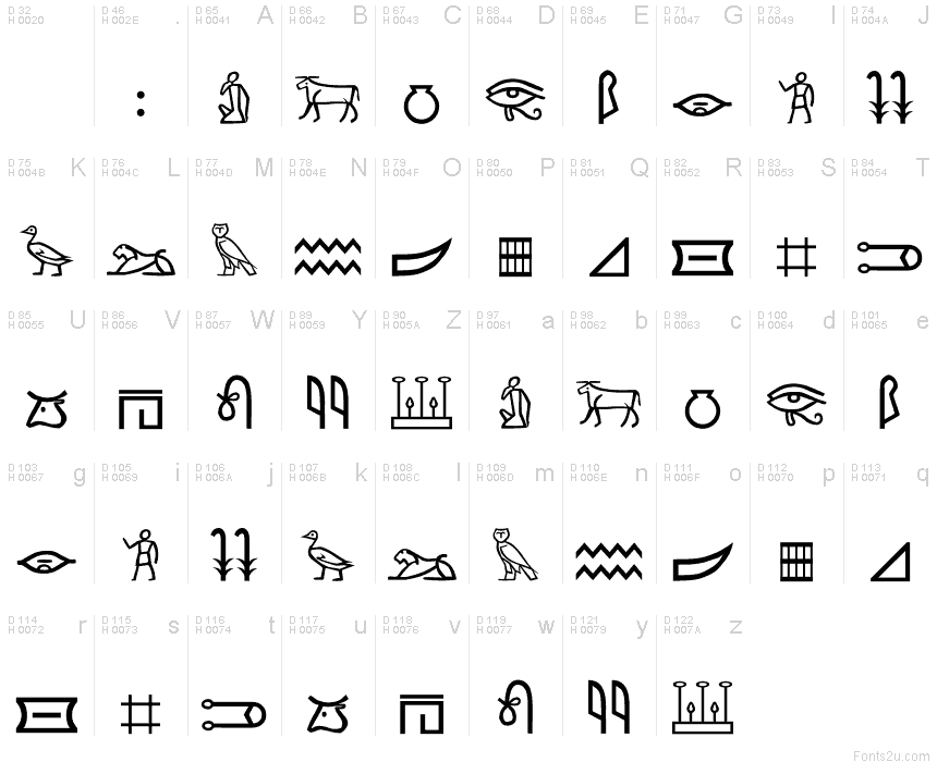
From the ancient Egyptians, Native Americans, and even artists and creatives in the Renaissance leading up to the installment of the Gutenberg printing press, the hand had a crucial and desirable role in design. Hand-carved hieroglyphs and symbols were the only form of visual communication at that time, and have become incorporated into modern day, but in a different way. 

http://i.fonts2u.com/rk/mp1_rk-meroitic-hieroglyphics_1.png
(Ancient Egyptian hieroglyphics)

Fast forward to today, where all we DO use Macbooks and InDesign, I believe the hand is still just as crucial to design. With all the digital work and computer-generated images constantly being put out left and right, incorporating bits and pieces of hand-done elements help to break up the monotony and bring a fresh voice into design. 


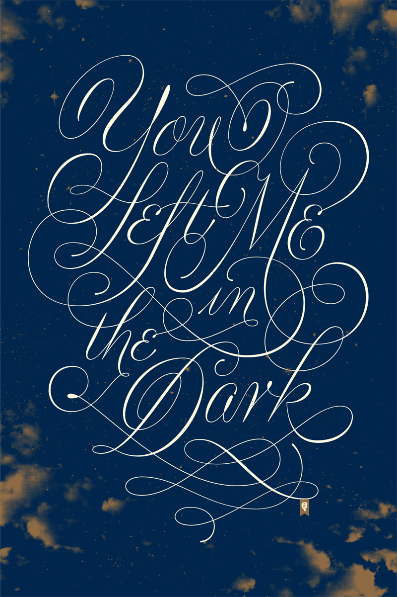
The trend these days seems to be going back to those simpler times of hand illustrations, funky screenprint textures and overlays, and hand done typography, evocative of the Victorian times through the sock hoppin' 50's and 60's. 

http://cdnpix.com/show/imgs/1393ebef8dba3d08d9bf856d81add0a4.jpghttps://blogger.googleusercontent.com/img/b/R29vZ2xl/AVvXsEhRG7r_sWxuGv8eV9eKMZ0l9DmlxlmlBBrtt9VwmgJAFkAPVlak9wtntzc7WUWdOpNMCOFhgH1fljr9WgV_LWtCFv8dGk6wXJQz59qCZKWDx3mqOLCXCEkx_hat-E5YzGxDI6SgBDJr1kqq/s640/Lolita+2.jpg https://webtoolfeed.files.wordpress.com/2012/07/florence.jpg
  
Paul Rand "Love Against Hate"                    Peter Mendelsund "Lolita"                              Jessica Hische               

Beautiful, right? Let's not lose the charm of the hand in our design, whether we're on the computer or on the light table.